Motion is a decision
Your search, knit into cloth. Below, every pattern has to say what it's for.
Interactive website design starts with what the motion is for.
You searched "interactive website design," which usually means you already know you want motion — and you're trying to work out which kind, and whether it will actually help or just show off. That is a design question before it is a code question.
Interactive design goes wrong when effects get chosen before jobs. A parallax layer that fights the reading order, a hover flourish on something that isn't clickable, a scroll-jack that steals the reader's own hand — each is a pattern doing the opposite of its job. Good interactivity does one thing: it points attention where the page needs it, and rewards the reader for looking closer.
I'm David Weaver. I designed and built the WebGL loom on this site's homepage — the one you can grab and pull apart. One person picks the patterns, writes the shader, and answers the contact form. Start with the picker below: it sorts motion patterns by the job they do, the risk they carry, and what they cost to build.
01
Pick a motion pattern by the job it does
Motion-pattern picker
Choose the interaction pattern that fits your brand risk and budget. Scores are relative (1–10) — impact vs. risk vs. build cost.
Reveal on scroll
Sections stitch in as you scroll. Lowest risk, highest polish-per-hour. Pair with KnitHero-style restraint.
02
Motion should do a job, or it gets cut
A pattern isn't good or bad in the abstract; it's right or wrong for a job. Before I animate anything, I write down what the reader should notice, in what order, and what they should be able to do. Then the motion serves that order. If a pattern can't name its job, it doesn't ship — it just adds weight and noise.
The best interactive design is usually close to invisible. You feel the page guiding you, not performing at you. When motion clarifies hierarchy, people rarely notice the motion at all — they just find what they came for faster.
03
Patterns, and the question each one answers
Every interaction below solves a specific design problem. The picker sorts them; here is the reasoning.
Scroll-triggered reveal
Controls reading order. It hands the reader one idea at a time so the hierarchy you designed survives a fast scroll.
Hover and focus states
The cheapest interactivity and the most skipped. It signals what is clickable — get it wrong and the page feels broken even when nothing is.
Pinned / sticky section
Holds one idea still while supporting detail scrolls past. Good for keeping a proof point on screen while you argue it.
Scroll-linked (scrubbed) animation
Ties progress to the reader's own hand. Memorable, and the easiest to overuse — one per page, tied to something that matters.
State-change micro-interaction
Confirms an action landed: a button that depresses, a form that visibly succeeds. This is trust, not decoration, and it's where most sites underinvest.
Draggable / physics object
Rewards curiosity by letting the reader touch the thing. Only worth its weight when handling the object is the message — like the homepage loom.
The reduced-motion variant
The pattern behind every pattern. Design the still version on purpose, not as a fallback, so the page still works when a device asks to calm down.
04
Where the motion earns its milliseconds
Interactivity isn't free, and the reader pays in load time and battery — so the budget is part of the design. The headline is the largest paint and loads first. Heavy motion mounts after the page is meaningful. Anything WebGL waits until it's on screen. A pattern that drops a phone below sixty frames is a design failure, not just an engineering one; jank tells the reader you didn't respect their time.
That's the discipline behind keeping Core Web Vitals green while the motion runs. The homepage loom is the public proof — a physics toy you can drag around a page that still loads and ranks. If a portfolio only has interactivity in video form, assume the live version couldn't survive being left running.
Proof over promises
Open the work. Judge it live.
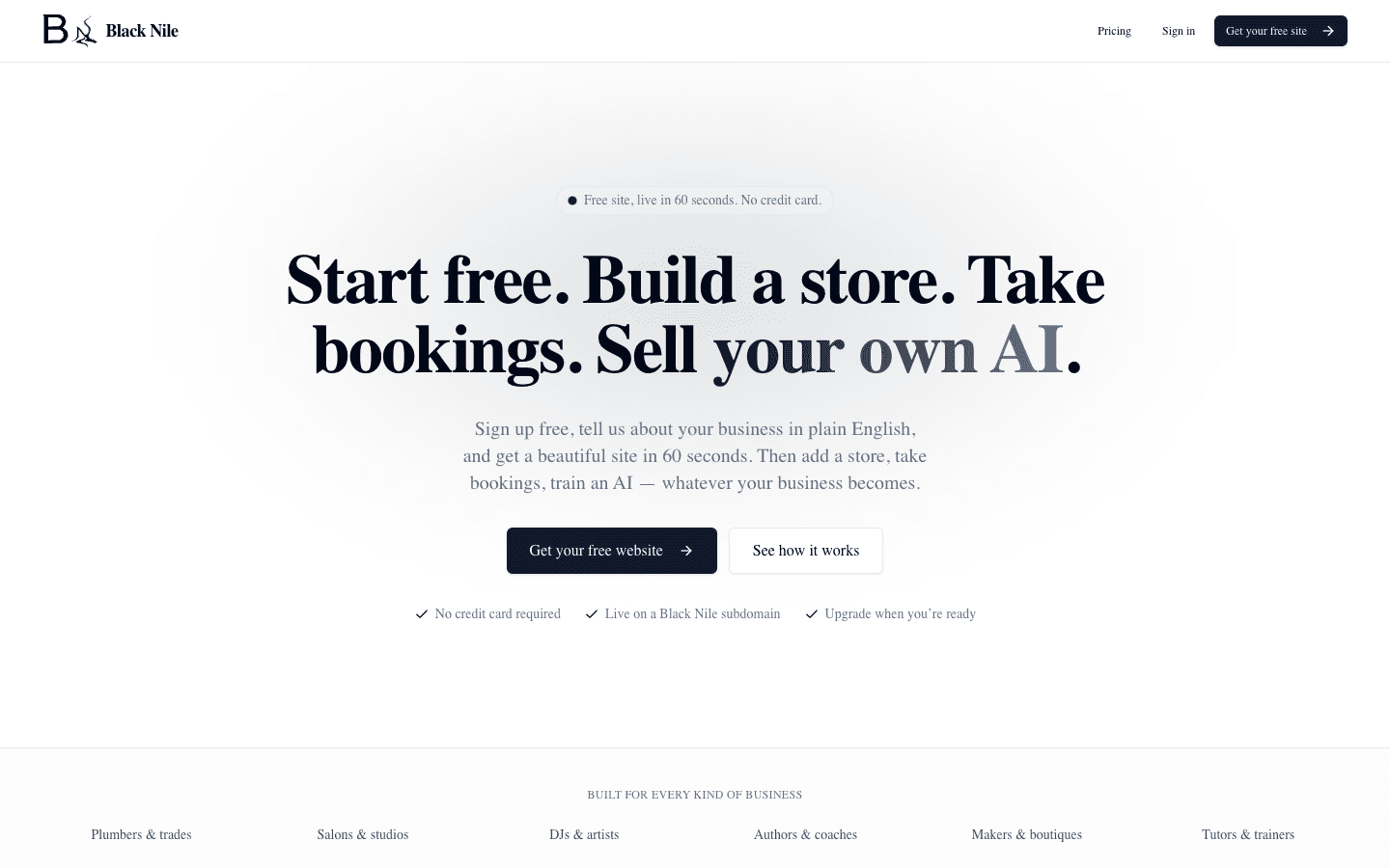
2026 · Software · Shipped
Black Nile
A conversational website builder where small businesses talk, a site appears, and their own AI answers customers — metered to the credit.
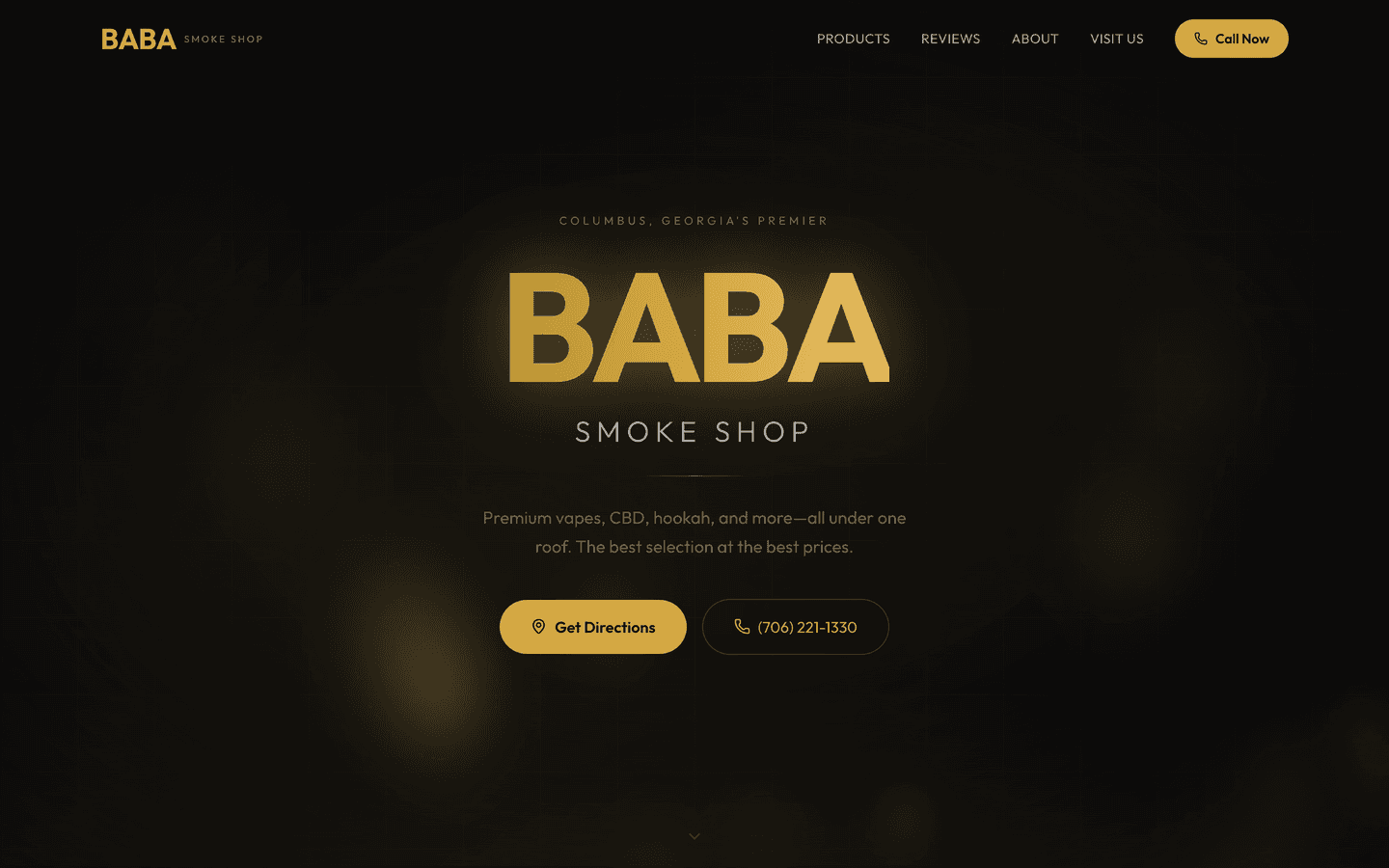
2026 · Software · Prototype
BABA Smoke Shop
A local-business marketing site for a Columbus, GA smoke shop. No backend, complete local-SEO metadata, and deliberate restraint.
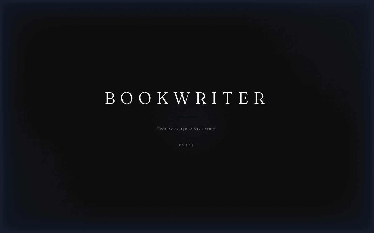
2026 · Software · Shipped
BookWriter
AI book-writing software from an author with thirty books of skin in the game — live, billing, and tested 454 files deep.
Straight answers
Asked often. Answered honestly.
- Which interactive elements are actually worth adding?
- The ones that answer a design question: a reveal that controls reading order, a hover state that shows what's clickable, a micro-interaction that confirms an action landed. Anything that can't name its job is load and noise. Run the picker above — it sorts patterns by impact against cost.
- Won't all this motion slow my site down?
- It can, if it's bolted on. Done as design, the budget comes first: the headline paints before any animation, heavy motion mounts after the page is usable, and WebGL waits until it's on screen. I keep Core Web Vitals green while the motion runs — the homepage loom is the proof.
- What about visitors who use reduced-motion or get motion sickness?
- The still version is designed on purpose, not treated as a broken fallback. When a device asks for reduced motion, the hierarchy and meaning still land — the page just holds still. That's a required pattern on my builds, not an optional extra.
- Can you add interactivity to my existing site, or does it need a rebuild?
- Usually a surgical add. A tuned reveal system, a motion pass on the hero, or one custom scroll piece can drop into a healthy codebase. A full rebuild is only worth it when the foundation is fighting you. Send the URL and I'll tell you which it is.
- How do I know the interactivity will look custom and not like a template?
- Because the patterns are chosen for your content, not pulled from a preset library. I write the commercial sentence first, then design the motion that serves it. Judge the craft before you pay — open /work, play the Roblox games, and pull the homepage loom apart.
The picker gave you a shortlist. Tell me what the page has to make a reader believe, and I'll send back a written plan — which patterns, what they cost, free and itemized.