Curation with a scorecard
Your search, knit into cloth. The gallery below is the argument.
The best interactive websites earn every effect they ship.
You searched for the best interactive websites. Most lists rank them by spectacle — biggest hero, wildest scroll. That is the wrong axis. The best ones use interaction to move your eye, hold attention, and push one decision, then still load clean on a phone. Everything else is confetti over a weak sentence.
This page is a curation with an opinion. The tool above scores any interactive site on the axes that actually separate the greats from the gimmicks — no affiliate roundup, no agency fog. A working machine and a point of view you can argue with.
I'm David Weaver — engineer, novelist, Roblox developer, musician as DWeaveai. I built the WebGL loom on this site's homepage: live craft you can pull apart with your cursor, not a video. One person designs, builds, and answers the form. If an interaction can't earn attention or a click, I cut it.
01
Score any interactive site on five axes
Interactive website examples — live scorecard
Pick a pattern. See how it scores on delight, clarity, performance, and originality — the four axes buyers actually feel.
Pointer-driven machine
Cursor spring physics, velocity sparks, cloth that tears and re-weaves — the homepage loom. Interaction is the product, not a decoration.
Want this class of interaction on your site — engineered so the H1 still wins LCP? That's the commission.
02
Interaction is a hierarchy tool, not a decoration
The best interactive websites answer a question the visitor is already asking: what matters here, and what do I do next? A hover that previews. A scroll that reveals order. A drag that teaches a product. Each one earns its milliseconds by making the next step obvious.
Gimmicks do the opposite. They animate the logo, delay the content, and make you wait for meaning. If an effect competes with your headline instead of serving it, it is a tax on attention. I write the headline first, then decide what deserves to move.
03
The five axes I score an interactive site on
This is the rubric behind the gallery above. A site doesn't need every axis maxed — but the best clear all five at once, which is rare.
Purpose
Every interaction points at one decision — a form, a purchase, a next scene. If you can't name what it's for, it's decoration.
Hierarchy
Motion guides the eye in the order the story needs. The headline still wins the first glance.
Performance
It stays smooth on a mid-range phone and keeps Core Web Vitals green. Jank teaches the visitor you don't respect their time.
Restraint
Reduced-motion is a designed state, not a bug. Turn the animation off and the site is still good.
Originality
The interaction fits this brand and no other. An effect everyone ships is a default, not a signature.
04
The quickest tell: turn the animation off
Here is the test I run before I'd put a site in any "best" gallery. Open it on a phone, throttle the connection, then switch on reduced-motion. The gimmicks fall apart — blank panels, content that never arrives, a hero that only ever existed as a video.
The real ones degrade gracefully. The words are already in the HTML, the layout holds, and the animation was a reward laid on top — not the load-bearing wall. That is the line between a page that ranks and ships and one that only looks good in a screen recording.
Proof over promises
Open the work. Judge it live.

2026 · Software · Shipped
Black Nile
A conversational website builder where small businesses talk, a site appears, and their own AI answers customers — metered to the credit.
2026 · Writing · Shipped
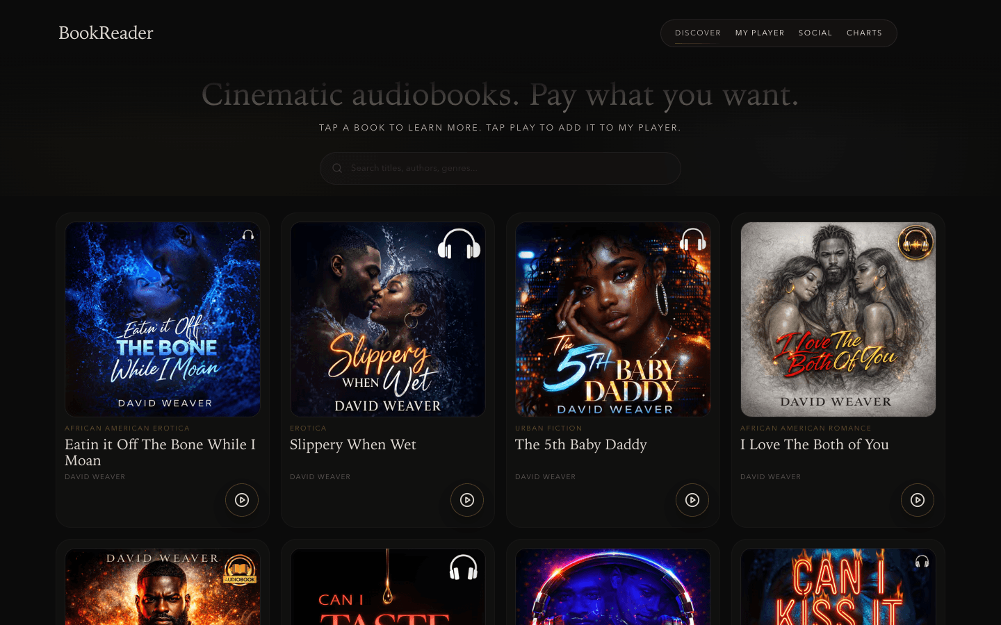
BookReader
Cinematic audiobooks where the listener names the price — pay what you want, minimum ninety-nine cents.
2026 · Sound · Shipped
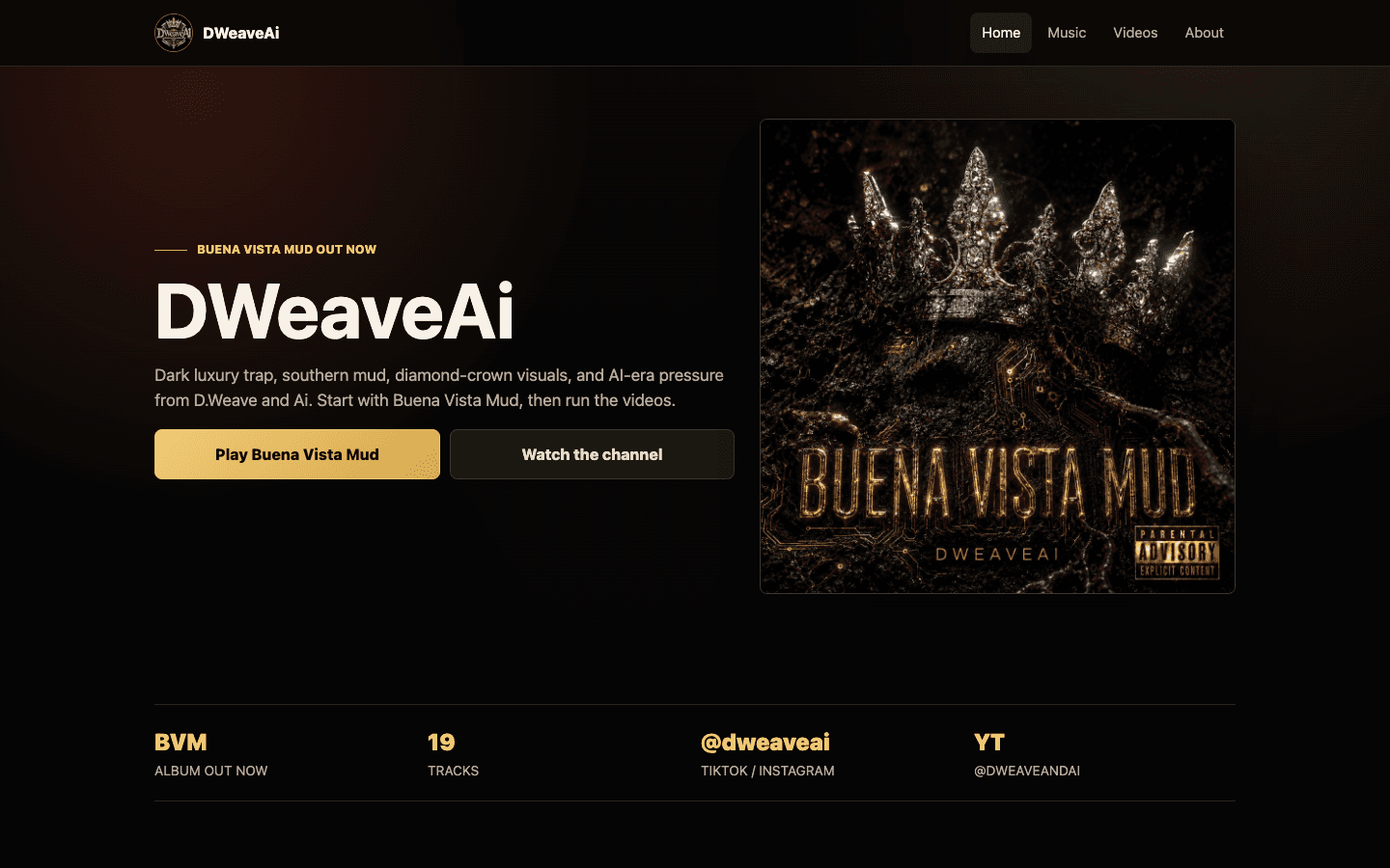
DWeaveAi Fan Funnel
A static fan funnel, live at dweaveai.space — one owned landing page per song, routing listeners to every streaming platform.
Straight answers
Asked often. Answered honestly.
- What makes an interactive website one of the best, not just the flashiest?
- Interaction that serves the visitor: it clarifies hierarchy, rewards attention, and points at one decision — while staying fast on a phone. Flash for its own sake fails the same test the gallery scores against. Effects are a means, not the trophy.
- Aren't the best interactive sites just the ones with the most animation?
- No. More motion usually means more delay before meaning. The sites I'd put in a gallery use less, better — every effect earns its milliseconds by making the next step obvious. Restraint is a feature, not a shortfall.
- Do interactive effects hurt conversion?
- Bad ones do — they bury the offer and make people wait. Good ones guide the eye toward the button and make a product easier to understand. Motion is a language; I write the sentence first, then decide what deserves to move.
- Can an interactive site be one of the best and still load fast?
- Yes, if it's engineered that way: HTML-first content, the headline as LCP, heavy media mounted after first paint, and reduced-motion designed on purpose. The homepage loom on this site is the public proof — interactive and still green on Core Web Vitals.
- How do you decide which interactive patterns are worth copying?
- I score them on the five axes above — purpose, hierarchy, performance, restraint, originality. A pattern that survives a mid-range phone and a reduced-motion setting is worth stealing the idea from. One that only works in a demo reel is not.
- I like a pattern from the gallery — how do I get it built for my brand?
- Run it through the tool, then send the form with thread "An app" and describe the outcome you want. The inquiry arrives labeled, and you get a written reply from me — not an account manager. Engineered for your brand, not cloned from a template.
Pick a pattern and score it above. If you want it engineered for your brand — not cloned from a template — send the brief.