Motion, with the restraint left in
Your search, knit into cloth. Below it, a menu and a knob to feel the timing.
Website animation ideas, sorted by where they belong.
You searched for website animation ideas, so you already know the easy part: there are thousands. The hard part is knowing which one belongs where, and how much is too much. That is what this page is for.
Below is a menu — scroll reveals, hover states, transitions, easing — each tied to the one place it actually earns. Above it is a playground where you drag the timing curve and feel the difference between motion that reads as craft and motion that reads as a screensaver.
I'm David Weaver. I built the WebGL loom on this site's homepage — real motion you can grab and pull apart, not a video. One person picks the ideas, writes the easing, keeps it green on a phone, and answers the contact form. The ideas are free. Fitting them to your brand and your Core Web Vitals is the work.
01
A menu of animation ideas, and where each one belongs
The idea is rarely the problem — placement is. Here are the ones worth stealing, and the single spot each one earns:
Reveal-on-scroll — for the claim you need read
A short fade-and-rise as a section enters the viewport. Use it on the two or three moments that carry your argument, never on every block. Move 12–24px, over roughly 300ms, then stop.
Scrubbed sequence — for one hero moment only
Tie progress directly to scroll so a single story unfolds as the visitor moves down. It is the most expensive idea here, in both attention and performance. Spend it once, near the top.
Hover feedback — for anything clickable
Cards lift a few pixels, buttons shift shade, links underline on approach. The cheapest, highest-trust motion on a page: it tells people what will respond before they commit.
One magnetic element — for a single signature
A button or logo that leans toward the cursor. A delight as an accent, exhausting as a system. Pick one, and leave the rest of the interface calm around it.
Route transition — to keep the site feeling like one app
A quick cross-fade or shared-element morph between pages so navigation does not feel like a hard reload. Keep it under about 250ms so it never slows the click.
State transitions — for tabs, filters, accordions
When content changes in place, animate the change so the eye can follow where things went. Height, opacity, position — small and fast. Instant swaps are what read as cheap.
Custom easing — the difference between the same two frames
Linear motion feels mechanical. Ease-out for entrances, ease-in-out for things moving between two states. Feel it in the playground below; most good UI motion lives between 150 and 400ms.
Stagger — to imply order without a word
Enter list items 40–80ms apart instead of all at once. The eye reads it as a sequence and slows just enough to notice. Overdo the delay and it starts to feel like buffering.
02
Drag the curve — feel the easing before you commit
Animation ideas — easing playground
Pick an easing, scrub duration, replay the motion, copy the CSS. Same craft that separates flat sites from immersive ones — free to steal.
Duration: 800ms
Best for: Hero entrances, page reveals
transition: transform 800ms cubic-bezier(0.22, 1, 0.36, 1);
03
What to reach for, by page type
The same idea is right on one kind of site and wrong on another. Match the motion to the job the page is doing:
| Page type | Reach for | Skip |
|---|---|---|
| Marketing landing | One reveal per real claim, hover feedback, a fast route transition | A scrubbed hero on every section |
| Product / app UI | State transitions, stagger on lists, tuned easing | Scroll effects that delay a tap or type |
| Portfolio / brand site | One signature moment, quiet reveals around it | Motion on every element, all competing |
| Content / blog | Subtle reveals that never block reading | Anything that shifts text as you scroll |
The pattern repeats: pick the two or three moments that carry the page, and keep everything around them still.
04
The one rule that keeps motion from becoming noise
Ask every animation a single question: what did it help the visitor understand or do? If the honest answer is that it looked nice, cut it. A page where everything moves has no hierarchy — motion only means something when most of the page holds still.
The sites people remember are not the busiest. They animate two or three moments well and leave the rest quiet. That restraint is the one thing the menu above cannot hand you, and it is why the same idea lands on one site and nauseates on another.
05
Make it survive a cheap phone and reduced motion
Every idea here has to hold up on a mid-range Android and respect prefers-reduced-motion. That means the headline is still the largest paint and loads first, heavy motion mounts after the page is usable, and the reduced-motion version is a designed state — a clean fade, or nothing — not a broken one.
Get this wrong and animation quietly costs you: layout shift, a slow first paint, a scroll that stutters. Get it right and none of it shows up in your Core Web Vitals. The homepage loom is the proof that spectacle and green scores are not a trade.
Proof over promises
Open the work. Judge it live.

2026 · Software · Shipped
Black Nile
A conversational website builder where small businesses talk, a site appears, and their own AI answers customers — metered to the credit.
2026 · Writing · Shipped
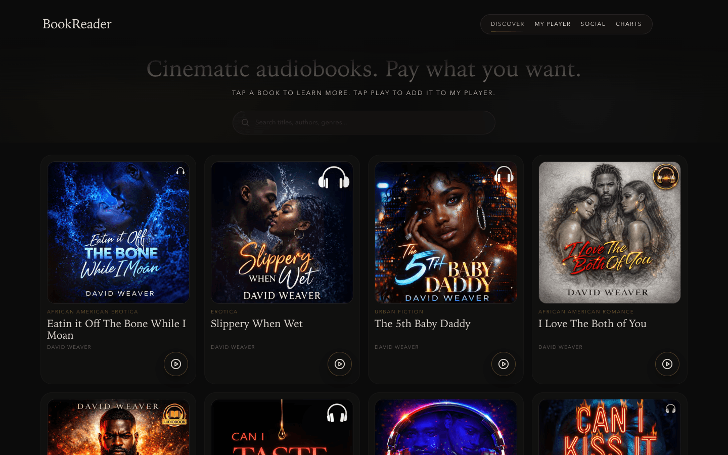
BookReader
Cinematic audiobooks where the listener names the price — pay what you want, minimum ninety-nine cents.
2026 · Software · Prototype
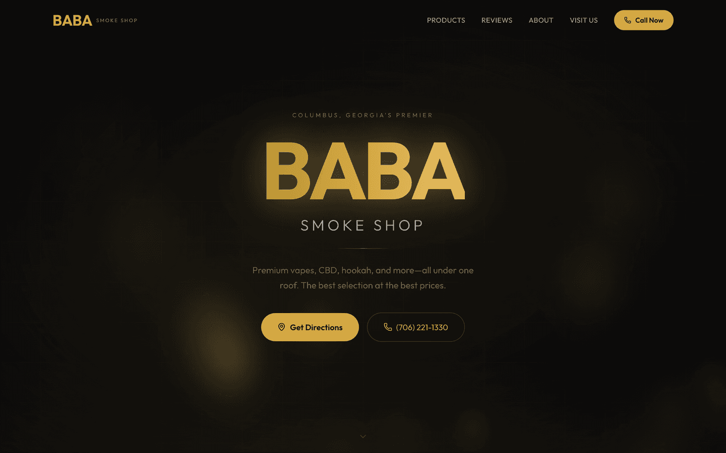
BABA Smoke Shop
A local-business marketing site for a Columbus, GA smoke shop. No backend, complete local-SEO metadata, and deliberate restraint.
Straight answers
Asked often. Answered honestly.
- Where should I actually put animation on a page?
- On the moments that carry meaning: the claim you need read, the thing that responds to a click, the change between two states. Not on every section. A useful test — if you removed the animation, would the visitor lose information or confidence? If not, it is decoration, and decoration is the first thing that ages badly.
- How much animation is too much?
- When the page has no still surface left, it is too much. I aim for two or three animated moments that matter and keep everything else calm. Motion works by contrast; if it is everywhere, none of it registers.
- What's the difference between an animation idea and an animation system?
- An idea is "fade the section in." A system is consistent timing, shared easing, a reduced-motion fallback, and a performance budget so all of it stays green on a phone. The ideas on this page are free. Turning them into one coherent system tuned to your brand is the part you hire for.
- Do scroll animations hurt SEO or Core Web Vitals?
- Only when they are built carelessly. Content should render in HTML first, so crawlers and slow connections see it without waiting for motion. Heavy work mounts after first paint, and reveals must not shift the layout. Done that way, animation and green vitals coexist — the loom on my homepage is the demo.
- What about visitors who get motion sick?
- You honor prefers-reduced-motion. When a visitor has that set, big movement collapses to a simple fade or nothing at all, and nothing important hides behind an animation they never see. It is a designed state, not an afterthought.
- Can you add motion to my existing site without a rebuild?
- Often, yes. A lot of this is surgical — a reveal system, a set of hover states, a route transition, better easing on what you already have. Send me the live URL and the two or three moments you want to lift, and I'll tell you what is worth animating and what to leave alone.
Pick the ideas that fit, feel the easing above, then send me the two or three moments you want built. You get a written plan from the person who writes the code.